Sales are what keep your little Ecommerce store afloat in the competitive and unforgiving sea that is the World Wide Web. So optimizing your store page for conversions is vital for survival.
In this blog post, we're going to talk you through some simple but effective ways to optimize your Ecommerce store.
OBSERVATION:
Did you know that
67.89% of shoppers abandon shopping carts? Did you also know that the average online conversion rate for retailers is only 3%? Maybe you do. But the real question is: What are you doing about it?
The best way to understand how a customer interprets your Ecommerce store is to observe your site as a customer would. If you're successful in driving lots of traffic then great! But, if you don't optimize your site to create an amazing user experience then you won't see any ROI on that traffic.
When thinking about the user experience you need to consider what
you look for when you're shopping online. A great way to do this is to go to another Ecommerce store, (maybe even a competitor's store) and go through the motions of online shopping: Searching a product, looking at the product, comparing this with others, adding to the cart, proceeding to checkout. If it was easy and stress-free then you know that site gives a pleasant user experience. Now do the same for your site.
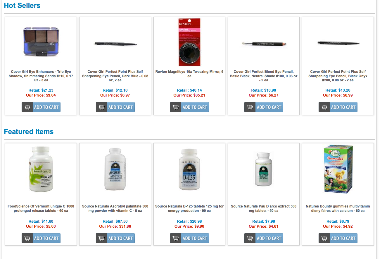
Below is an example of a website that offers a great user experience. The products are easy to see and so are the prices. The page isn't stuffed with too much text, and each product has the same amount of space as the next. However, the best factor about this site is how clear and distinct the Call to Action buttons are.

PRESENTATION:
There are so many Ecommerce stores out there. In order to stay competitive and keep conversion rates high you must ensure every aspect of your site is as close to perfection as you can get it. You may have the best quality, lowest priced products on the internet, but if the layout of your store isn't pleasing to the eye then customers will leave as fast as they arrived.
The trick is to find the balance between too much happening on the page, and not enough. If your website is cluttered with low quality images and longwinded descriptions, then your products aren't going to look desirable. Your site needs to look neat, tidy, and structured. If you're struggling to decide what needs to be included then put yourself in the customer's shoes again. Consider information that is absolutely essential in order for a customer to make the decision to purchase: measurements, size, material, delivery costs etc.
TRUST:
This is possibly the most important point that will be mentioned in this blog. Customers visit your online store, hand over their money and wait for you to deliver the product you have promised -- this takes a lot of trust. In order for customers to trust you there are a number things you must do.
First, make it clear that you are easy to contact. The Ecommerce store below not only has their telephone number in full view. They also have a live chat feature available. Both of these factors instantly make the buyer feel safer about shopping on this site. Now, Eurway could have left it here, but they have gone even further to prove to potential buyers that they are a trustworthy, reputable, store. They have noted how many years they have been in business, and also offered free shipping so that customers know there will be no nasty surprises at the checkout. Including information like this on your homepage doesn't take up much room and can really improve your conversion rate.

You can
even take it further by adding information like: 'Easy Return Policy'
or Trustmarks (such as the ones pictured below). The key to trust is
answering all of the customers' doubtful questions before they have
the chance to ask.

Another
useful way to show how trustworthy you are is to include product
reviews. If you already offer a review section then be sure to
encourage your customers to fill them in as studies have proven '50
or more reviews per product can mean a
4.6%
increase in conversion rates'. Also, you needn't worry about getting
bad reviews, as the same
studies showed, 'People
that seek out and read bad reviews convert better, as the very fact
that they are paying such close attention means they are more likely
to be in purchase mode'.
The
Ecommerce store below shows their most recent reviews in a small box
in the right hand corner of their homepage.

INVENTIVE COPY:
The
more unique your copy is, the more it will stand out in search
engines and interest customers. Persuasive product descriptions go
hand in hand with great images, if one isn't up to scratch then you
run the risk of customers not looking at either. The key is to keep
your copy short, relevant, and optimized with keywords. It is also
essential that you pay attention to grammar and spelling as this can
scream unprofessional to a potential customer.
MAKE YOURSELF CLEAR:
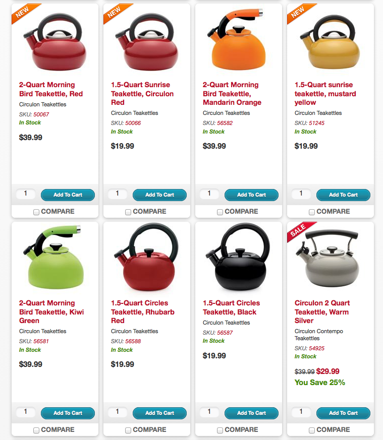
Take a look at the webpage below:

The message of this store is clear: We sell teakettles and want you to buy one!
The products are evenly spaced and each contains similar, basic content. The add to cart button is clear and so are the prices. It's clarity such as this that makes it easy to buy from this store. Another useful thing that this store does is use 'badges'. In the top left hand corner of certain products there is a 'new' badge, or a 'sale' badge. This is a great way to attract attention as the badges stand out (and ultimately ask for the sale), without taking focus away from the products.
IMAGES:
Online shoppers don't get the chance to stroke, lift, smell, or taste their product. When they commit to buy, the only interaction they have with their purchase is looking at the image. So make the experience as realistic as possible for them by showing clear, great quality images. To further improve conversions you could introduce a 360 degree viewer of your products, or if you offer multiple colors make sure you show a photograph of each color. Check out this website below, for a great example of how powerful you can make images in order to create more conversions.

Z.E.O, OOPS, WE MEAN SEO! (HOW SILLY OF US...):
A lot of Ecommerce business owners make the mistake of including duplicate content on their websites -- if you do this it can cause you to be penalized by search engines and therefore, seriously hurt your conversion rates. Duplicated content can look like overstuffed keywords to search engines so you have to be careful when writing descriptions for similar products. As shown on the website above, if you have a product that comes in a variety of colors it is best to include them all on one page, this way no content will be duplicated.
Another way to optimize your SEO to gain conversions is to create semantic (clear, friendly) URLs -- Search engines love them and it will create further customer conversions too because customers trust URLs that let them know exactly where they're going.
EXPERIMENT:
The only way to truly find the best way to optimize your store for conversions is to experiment! Every store is different, and what works for others may not work for you. Try new things, mix it up, and see how our ecommerce SEO features can help your conversions.
Like the look of any of the websites in this blog? They are all clients of AmeriCommerce! So if you need help with design, revamping your current store, or just some friendly advice, get in touch! :)